SkinQ approached Lucid with the requirement to reimagine their brand and packaging entirely.
Noticing a plateau with their existing assets, which had difficulty communicating their breadth of products and their specific functions, SkinQ sought a total redesign. Additionally there was a desire to position the brand as a sophisticated and world-class player in the space, rather than playful as it was previously. The identity also featured a confusing symbol that detracted from understanding the name as SkinQ, so an additional objective was to make that crystal clear.
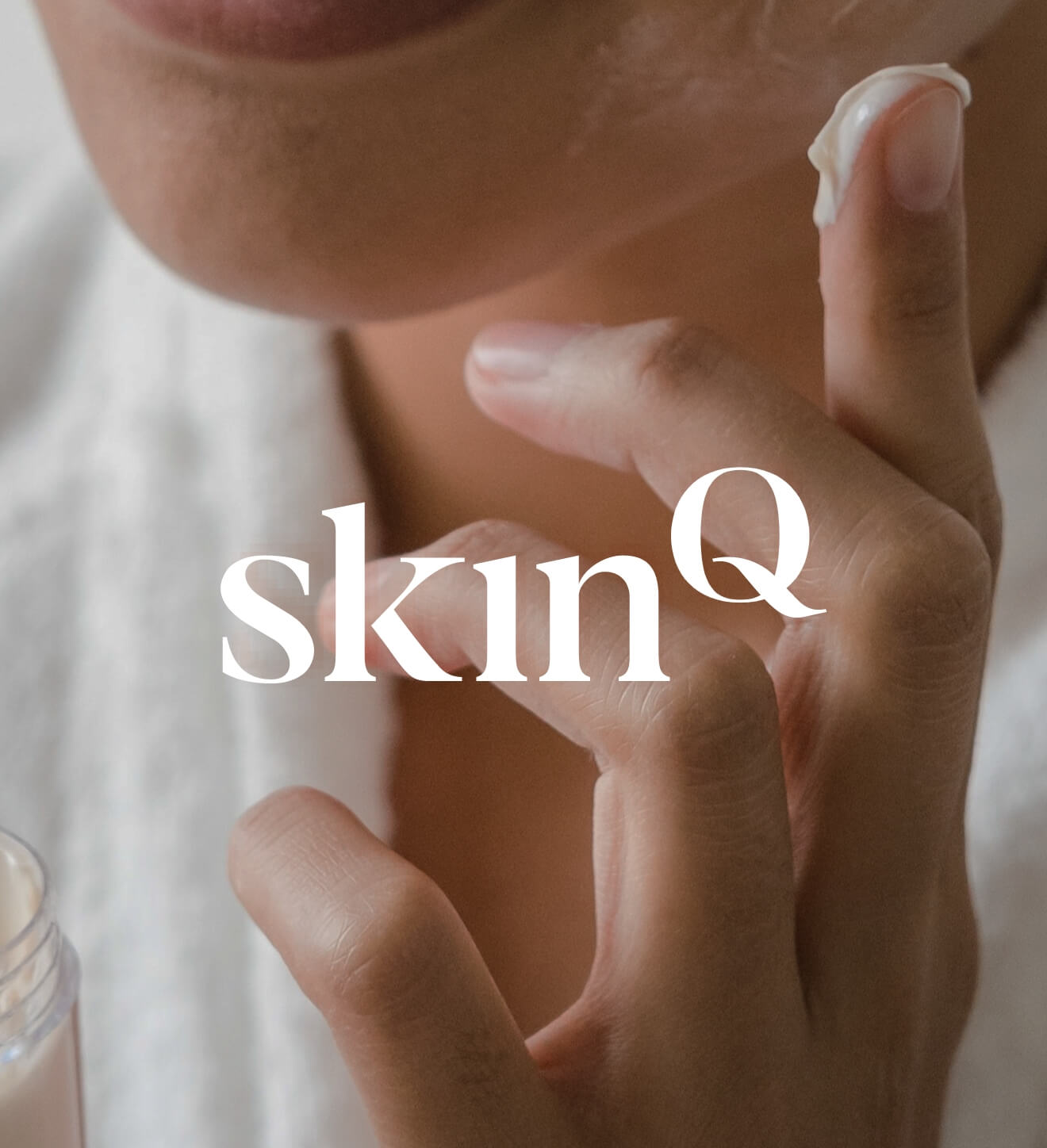
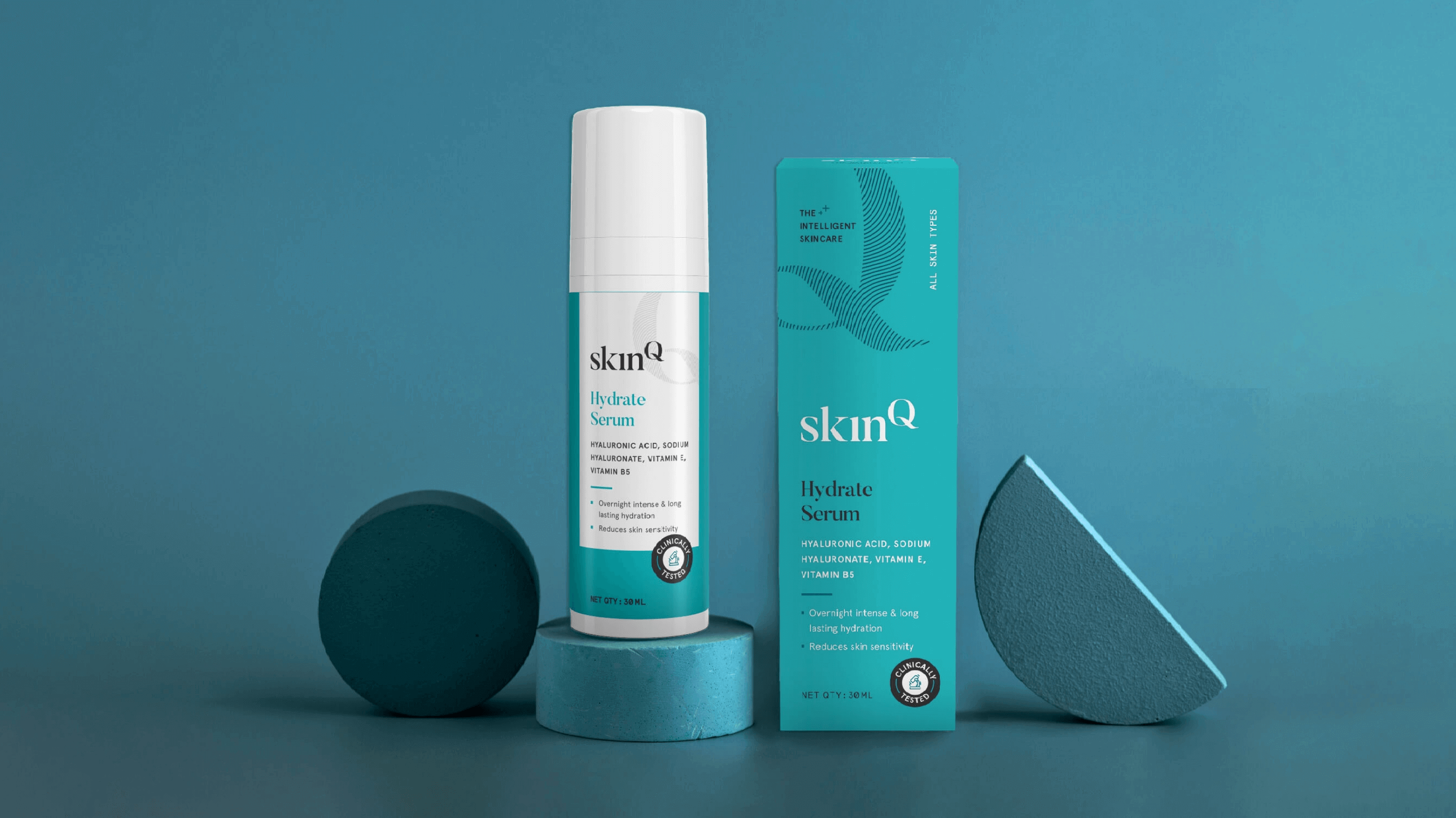
Rooted in science, the brand’s identity was built around the idea of the Q as the power of skin. This also gave us the opportunity to turn the Q into a unique monogram composed of delicate wavy lines that further build the connection with scientific formulations, also subtly communicate that skincare is personal like a fingerprint and needs to be understood by professionals in order to get the right results.

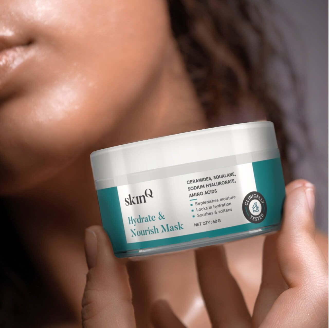
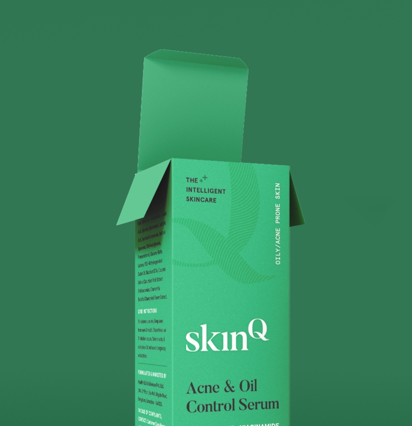
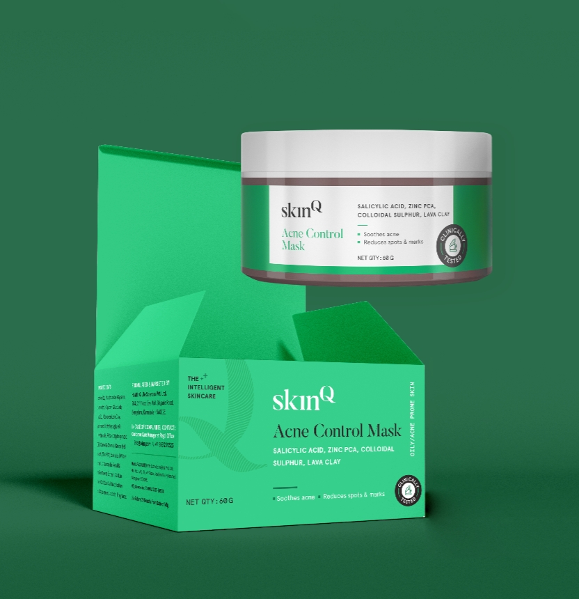
We established a unique colour for each, based on function. The pack hierarchy was paramount in recognising the brand first and foremost, and then the function and name of the product, followed by the active ingredients and then the benefits.
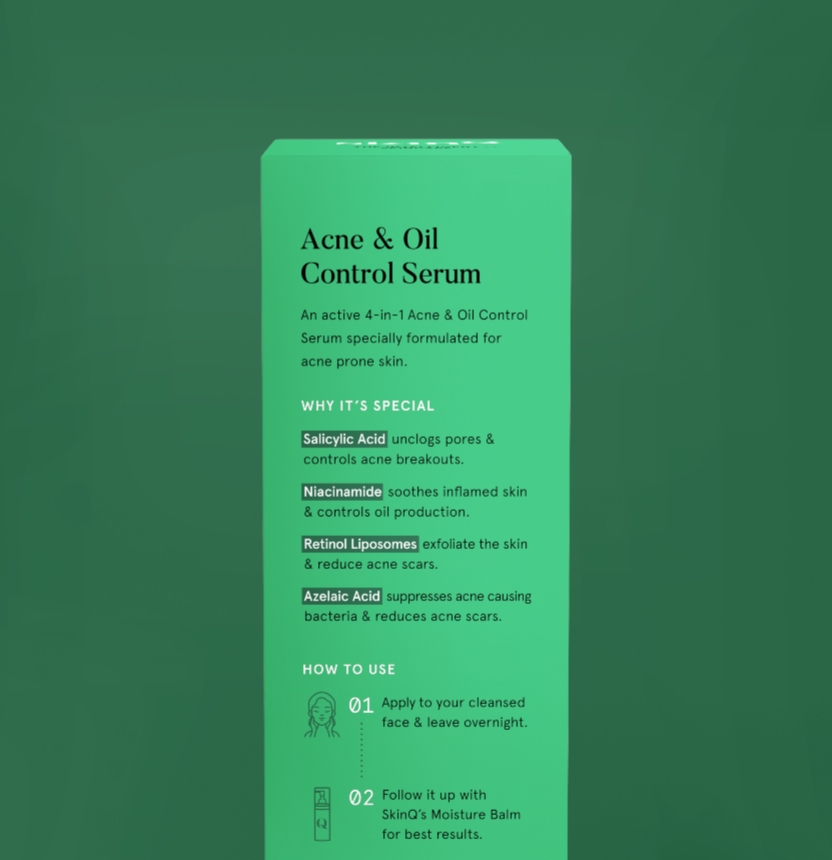
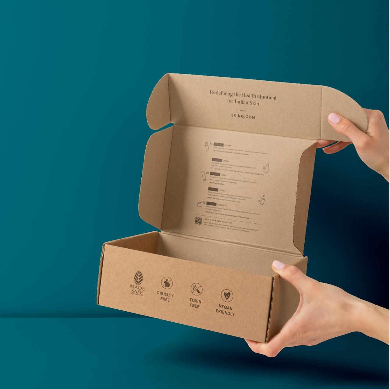
A celebrity dermatologist–formulated offering, specially created for Indian skin, this was communicated clearly on the back of packs and boxes—along with what makes each product special and how best to use it. The gift box also played a prominent role in the overall brand architecture, helping customers navigate their most optimal skincare routine.