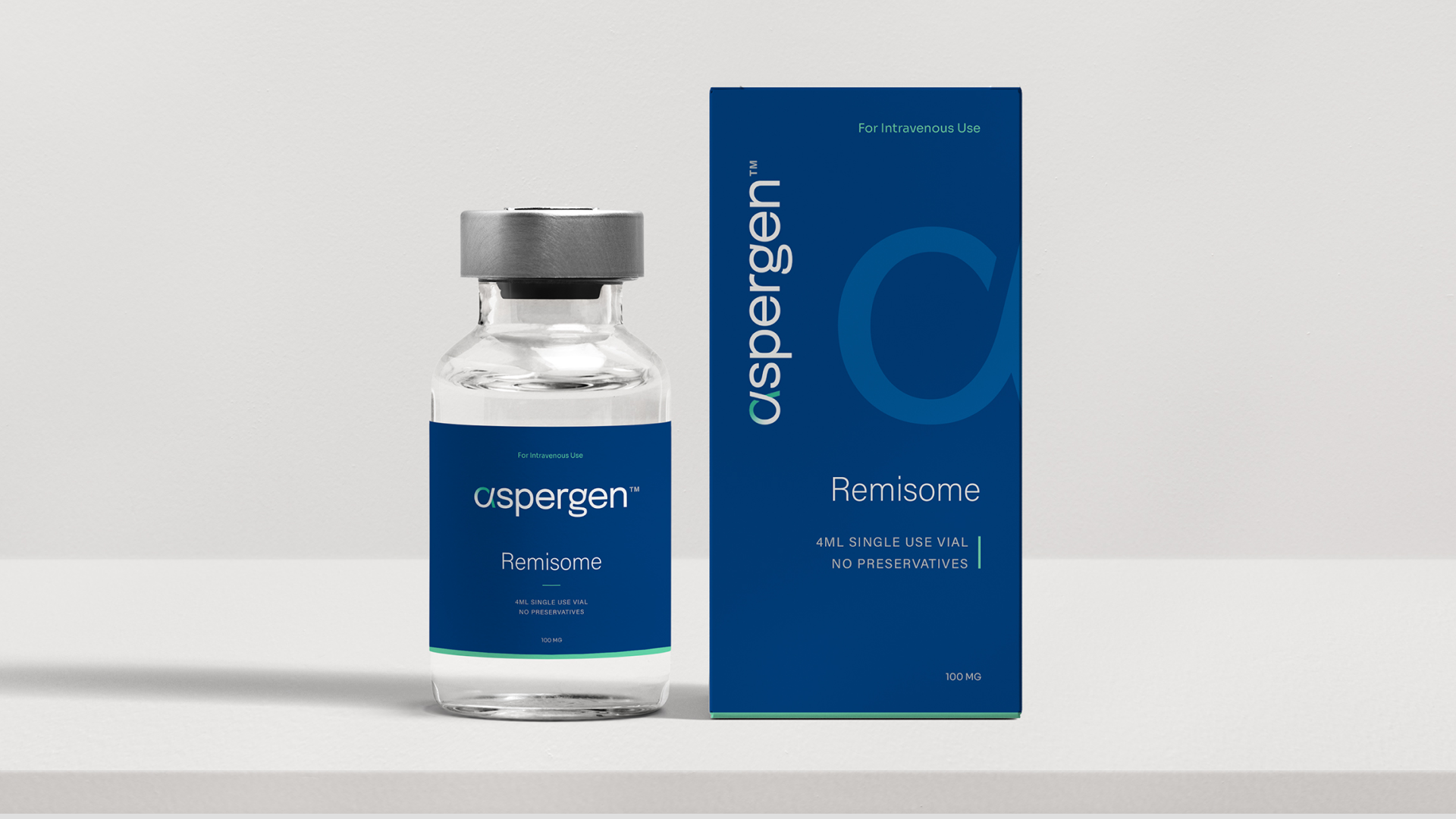
Aspergen is a joint venture between two veterans in the pharma industry: Cipla and Kemwell Biopharma. Headquartered in the US, Aspergen’s sole purpose is to bring affordable biosimilars to global markets, providing a viable alternative to expensive biologics medicines.
As such, the brand identity needed to reflect a distinctly US sensibility. One that local consumers could easily recognise and relate to, while also conveying a high level of expertise, quality, and credibility. This is where Lucid’s extensive international experience, and deep understanding of the US market in particular, proved invaluable.
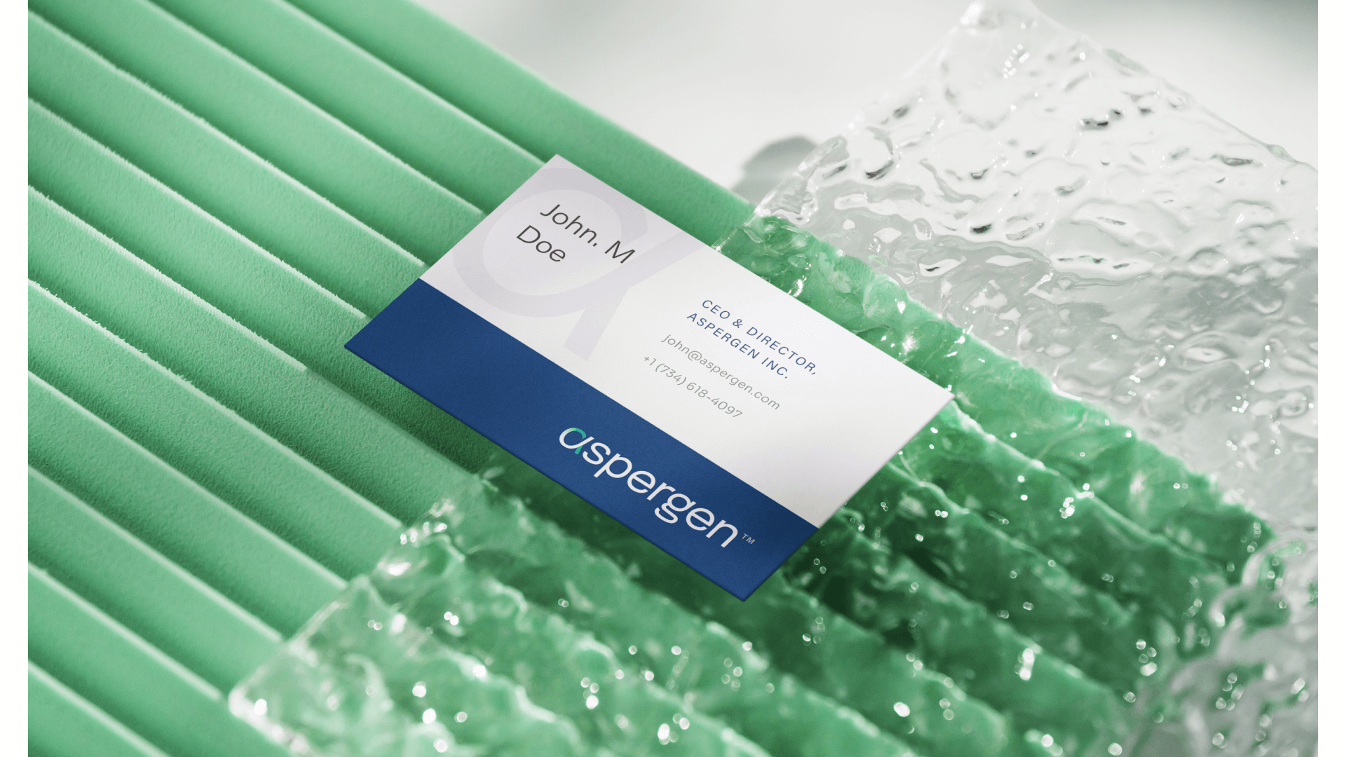
Built around the alpha symbol, a recurring concept in the world of biologics, the logo features a contemporary, distinctive, and confidence-inspiring, typography-led design. The letterforms convey a sense of progress and innovation, reflecting the company’s cutting-edge work, while introducing depth and dimension that signal its advanced capabilities.

Alongside the wordmark, a standalone monogram based on the alpha symbol was developed. Designed to work independently or as a subtle watermark, it reinforces the identity across multiple touchpoints, adding layers of meaning and visual depth.
The typographic system was chosen to communicate scientific credibility, clarity, and global relevance, while helping a complex and highly technical field feel more accessible and human. The overall design reflects a creative partnership, visually representing the coming together of scientific expertise and purposeful design, and echoing Aspergen’s own collaborative approach within the biosimilars space.
The identity was formalised within a comprehensive brand guidelines document, defining colour, typography, texture, imagery, and their application as a cohesive, singular expression. Together, these elements reinforce Aspergen’s mission: improving patient access to life-changing therapies by combining cutting-edge science, rigorous research, and regulatory expertise to deliver innovative biosimilar solutions.